
 English
 简体中文
简体中文 Español
 Français
 Deutsch
 Русский
 Português
 Italiano
 日本语
日本语 한국어
한국어 العربية
 Türkçe
 Tiếng Việt
 ไทย
ไทย Indonesia
 Melayu
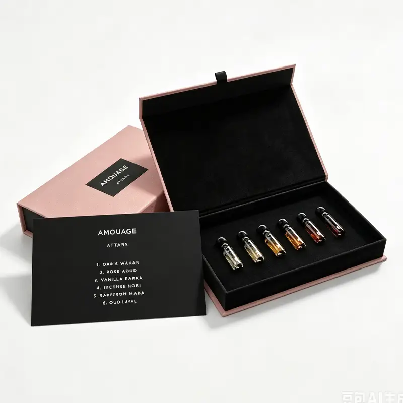
During the high-stakes launch of a new beauty product, cosmetics brand managers and procurement teams frequently encounter a frustrating nightmare: the flawless Pantone spot color chosen in the digital design file turns into a muddy, off-shade mess once printed on physical cosmetic paper boxes. Even worse, multiple gift boxes within the same product line end up with visible color variations, severely damaging the brand’s premium display on retail shelves.
It’s easy to blame these color shifts on “poor printing craftsmanship.” However, the truth is that from digital design proofs to mass production, countless hidden variables affect ink behavior. When cosmetic packaging box color discrepancies exceed acceptable thresholds, the result is not just a delayed launch—it often means thousands of wasted custom boxes and massive financial losses.
For premium cosmetics brands seeking consistent visual perfection, relying on traditional “eyeball checks” by experienced press operators is long obsolete. Here is a breakdown of why color shifts happen during custom cosmetic packaging box manufacturing and how a digital color management solution keeps color variation strictly within Delta E (ΔE) < 1.5.
1. Why Visual Inspection Fails in Custom Cosmetic Packaging Box Production
To deliver a tactile and luxurious experience, luxury beauty brands often select textured specialty papers, uncoated cardstock, or soft-touch matte films for their cosmetic paper boxes. However, these premium substrates introduce complex physical variables:
- Ink Absorption: Uncoated artistic paper has larger fiber pores, absorbing spot inks quickly and making the final output look dark and dull.
- Surface Film Interference: Matte or gloss laminations alter light refraction, causing vibrant Pantone spot colors to shift or lose saturation.
- Lighting Metamerism: Colors look drastically different under natural sunlight, warm factory lights, and cold white retail spotlights—a visual illusion known as metamerism.
With years of expertise in custom box manufacturing, Shengcai has established a foundational principle: Subjective human inspection without digital data and standardized light sources is the root cause of color failure.
2. The 4-Step Digital Solution: Keeping Delta E < 1.5 in Cosmetic Box Printing
To solve color consistency challenges once and for all, Shengcai implements an end-to-end digital color control system covering proofing, ink mixing, and mass production:
Step 1: Spectrophotometer Data Collection for Lab Color Profiles
Say goodbye to vague descriptions like “it looks a bit too red” or “it needs more pop.” Using precision spectrophotometers, we capture exact CIELAB parameters from standard Pantone guides and client-specified spot colors. Every brand receives a dedicated digital color file. Both sample proofs and mass production batches are governed by a strict threshold of ΔE < 1.5—a level where color variations are virtually invisible to the human eye under any lighting.
Step 2: Substrate-Specific Ink Compensation Formulas
The exact same Pantone formula yields drastically different results on high-coated white cardstock versus highly absorbent specialty paper. When handling custom cosmetic paper box orders, Shengcai’s pre-press technical team analyzes paper porosity and base tones beforehand:
- Absorbent Specialty Papers: Brightness compensation pigments are added during ink mixing.
- Dark Spot Colors / Uncoated Stocks: A pre-printed white ink base layer is applied to isolate the paper’s natural background color from affecting the surface ink.
Step 3: Standardized D50 & D65 Light Box Inspection
Disagreements over color between factories and brand owners often stem from non-matching inspection environments. Shengcai equips its production facility with D50 and D65 standardized light booths. All color approvals, batch spot-checks, and final inspections are conducted strictly under standardized light to eliminate environmental lighting distortions.
Step 4: End-to-End ICC Profile Synchronization
By utilizing standardized ICC color management profiles, we sync the designer’s monitor display, digital proofers, and offset printing presses under a single color conversion standard. This achieves true “what you see is what you get,” eliminating discrepancies between screen colors, proofs, and final mass production.
3. Traditional Visual Inspection vs. Shengcai Digital Spectrophotometry
| Comparison Dimension | Traditional Visual Inspection | Shengcai Digital Spectrophotometry |
| Standard Basis | Relies on operator subjectivity; no fixed quantitative data | Spectrophotometer captures Lab parameters with full ΔE reports |
| Light Source Resilience | Highly vulnerable to ambient light, weather, and room lighting | Uses D50/D65 standard light booths to eliminate lighting variables |
| Batch-to-Batch Consistency | Color shifts frequently occur when operators or ink batches change | Digital ink formulas archived for consistent ΔE < 1.5 across reorders |
| Proofing & Communication | Slow physical sample mailing; hard to define color tolerances | Digital color data delivered with samples for clear, measurable standards |
4. Procurement Checklist: 4 Pitfalls to Avoid in Cosmetic Packaging Color Control
- Lock Paper First, Color Second: Select your final cosmetic paper box substrate before locking in the Pantone color number. Never use white cardstock proofs to guide specialty paper production.
- Never Approve Colors via Smartphone Photos: Smartphone cameras apply automatic color correction and filters, making photo approvals unreliable. Always inspect physical samples inside a standard light box.
- Unify Brand-Wide Color Files: If a product line includes labels, folding cartons, and rigid gift boxes, archive all color parameters into a single shared ICC profile.
- Retrieve Archived Ink Formulas for Reorders: When placing reorders, insist that the supplier pulls historical digital ink formulas to ensure seamless color matching between old and new batches.
5. Frequently Asked Questions (FAQ)
Q1: Why does a Pantone color look bright on the swatch card but dark when printed on my specialty paper cosmetic box?
A: Specialty artistic paper lacks a top coating, allowing paper fibers to absorb spot ink rapidly and lowering surface brightness and saturation. This can be corrected by adding brightness compensation agents during ink formulation or applying a pre-printed white ink base layer.
Q2: How can we ensure spot color consistency across a skincare set with various cosmetic paper box sizes?
A: Paper substrates, lamination types, and ink formulas should be standardized before starting. A shared digital color file must be established for the entire line, and all box sizes should be approved together under a standardized light booth before mass printing.
Q3: Can small-batch trial orders for new cosmetic paper boxes use this digital color management system?
A: Yes. Shengcai applies the same high standards to all orders. Whether for a small-batch prototype or a large-scale reorder, we perform spectrophotometer calibration and standardized light inspection without lowering quality controls.
Q4: Does lamination affect the spot color of cosmetic paper boxes? Should we adjust color values in advance?
A: Yes. Both matte and gloss laminations alter light reflection and color perception. Shengcai creates sample proofs using your chosen film substrate and pre-adjusts ink formulas to compensate for lamination shifts before mass production begins.